1139.04 APPENDIX.
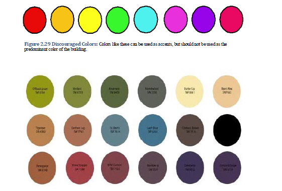
Figure 2.30 Appropriate Colors in Moderation: These are colors to use in moderation, and would work well for accentuating architectural details.
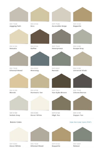
Figure 2.31: Encouraged Colors - these colors are more neutral and fit the traditional color palette of the downtown. (Ord. 2018-035. Passed 5-1-18.)