1139.02 DESIGN GUIDELINES.
These design guidelines help convey the desired architectural quality and design for the Downtown Design Review District. These guidelines are used by the Design Review Board to help guide the decision-making process.
2.00 - General Building Design.
The purpose of the Design Review Guidelines is not to define a specific style or period of architecture. Instead, the Design Review Guidelines are intended to encourage alterations, renovations and new construction which are distinctive in character, aesthetically pleasing and built of lasting quality.
In general, buildings in the Downtown Design Review District should:
• Have a singular architectural style.
• Use durable, high quality materials.
• Preserve historic buildings or details when feasible.
• Use neutral color schemes.
• Be pedestrian friendly.
• Create or maintain a unified street wall.
• Incorporate landscaping and greenspace when possible.
• Give equal emphasis to all exposed façades.
• Have a compatible or complimentary architectural design to its neighbors.
• Utilize signage designed for pedestrians.
• Hide mechanical equipment from view.
Buildings should not:
• Mix several architectural styles.
• Use bright, florescent, shiny, reflective paint or materials.
• Lack architectural features
• Use cheap, low quality materials.
• Have one-sided architecture.
The Design Review Board will review each applicant based upon their compliance with the following design objectives:
1.01 Building Massing
1.02 Building Materials
1.03 Building Façade
1.03.1 Windows
1.03.2 Entrances
1.03.3 Awnings
1.03.4 Signage
1.03.5 Lighting
1.03.6 Colors
1.04 Site Improvements
1.04.1 Fencing
1.04.2 Parking Lots
1.04.3 Landscaping
1.04.4 Mechanical Systems
Applicants should ensure that the Design Guidelines have been considered in their application. Failure to consider all aspects of the Design Guidelines may result in a denial of the application.
2.01 - Building Massing.
The physical qualities of massing, scale, and form help to determine whether buildings are sensible to their context. Traditional Main Street commercial buildings have demonstrated physical qualities that make them proportionate to the street space and appropriate to the pedestrian scale. Generally, buildings are two to five stories tall, and built to the lot line and form a continuous frontage on Main Street. Overall, these buildings demonstrate proportions, rhythm, and details that are traditional in character. In addition, the overall building design is important to create a sense of place, enclosure, and activity. The following guidelines are offered:
• Building massing, height, and lot coverage should be proportionate to adjacent buildings. Appropriate massing will assist in creating a sense of enclosure.
• Primary façades should be located near the right-of-way line. Buildings located at the street edge enhance both the urban quality of the street and the pedestrian experience. Conversely, buildings set back away from the right-of-way detract from the urban experience and should be avoided.
• Buildings should extend and establish a continual street wall.
• Plazas and outdoor cafes are encouraged as they continue street wall whereas parking lots are discouraged as they eliminate the street wall.
• Single-story buildings should be avoided along the major corridors. The size, spacing, and location of neighboring buildings may allow for single-story buildings in some cases.
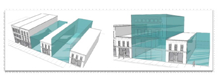
Figure 2.01: Appropriate building massing - subtle variation in building height positively contributes to the urban experience. Notice this example has a continual street wall with no gaps between buildings.
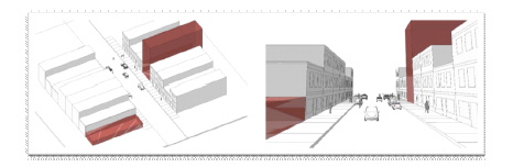
Figure 2.02: Inappropriate building massing - too much variation in height does not present uniform street front. Of most concern is the single-story building which deteriorates the sense of enclosure.
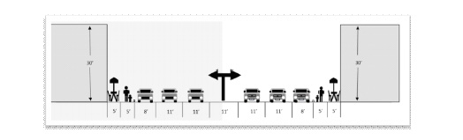
Figure 2.03 Building height, street width ratio: This illustrates a good design criterion that is the street width to building height ratio (1:3 Building heights to street width). Maintaining this ratio helps create the urban sense of enclosure.
Figure 2.04 Street Gaps: Avoid major gaps in street wall
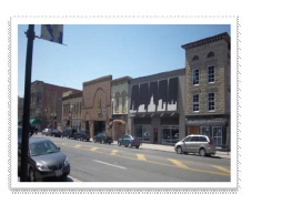
Figure 2.05 Street Wall: Example of a strong street wall
2.02 - Building Materials
Building façade materials are essential elements that tie the building to its surroundings and visually impact the surrounding environment. In addition to other design features, traditional façade materials allow buildings to appear suitable and harmonious to their context while other materials can appear distracting.
• Base materials should be consistent and new materials should complement the existing.
• Repair and restoration of original features and materials such as brick, stone, wood siding, etc. is highly encouraged. Covering original features and materials, however, is discouraged.
• Building materials such as utility brick, concrete masonry units, and Exterior Insulating Finishing Systems (EIFS) as a primary façade material are discouraged but may be used as accent materials.
• Building materials such as brick, stone, manufactured stone, terra cotta accents, metal accents, and wood are encouraged as they provide visual interest and assist in creating a pedestrian friendly corridor.
• A horizontal expression should establish the ground level of the building from the rest of the building. The expression should complement adjacent buildings and reinforce the street as a pedestrian friendly space.
• Materials should be used to differentiate between the importance of building features and provide visual separations between material functions.
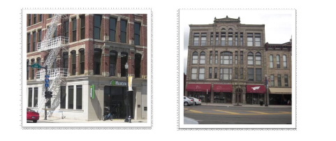
Figure 2.06 Appropriate Building Materials: Good use of brick, stone, and canvas awnings.
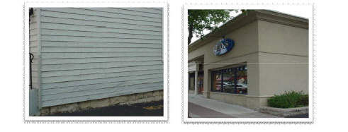
Figure 2.07 Discouraged Materials: Discouraged - vinyl and aluminum siding, and EIFS as a primary material.
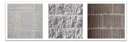
Figure 2.08 Discouraged Materials: Discouraged - utility masonry
2.03 - Building Façade
Features that extend out from the building façade can contribute to the character, scale, and visual interest of the street.
• Consider entire blocks as a single façade - use similar or complementary materials, colors, elements to create a unified appearance.
• Façades should reflect proportionate shapes and patterns. Unarticulated walls create poor visual appearance, and do not relate to the base or the roof.
• Façades should be visually appealing through detailing, openings, and materials.
• Corner buildings are buildings exposed on two streets. Corners of these buildings should be articulated and elaborated to reflect this importance.
• There should be a clearly defined top, middle, and base seen on the outside.
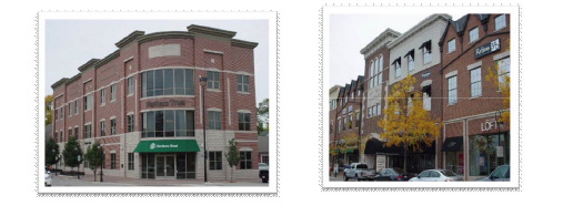
Figure 2.09: Encouraged Building Façade - These figures exemplify use of similar and complementary materials, proportionate well-spaced windows, appealing building details, and well-defined top, middle, and base.
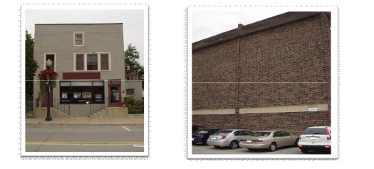
Figure 2.10 Discouraged Façade: These figures illustrate poor design through lack of detail, poorly spaced windows and doors, no sense of top, middle, and base, and minimal variation in materials and brick color.
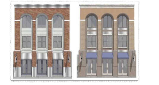
Figure 2.11 Encouraged Façade: Another example of encouraged façade design styles. Again, we see complementary materials, well-patterned building openings, and a variety of architectural details.
2.03.1 - Windows
• Ground floor windows should be designed to encourage retail uses. Generally, the majority of the first floor should be windows as they enliven the streets and provide both interest and activity at the street level.
• Knee walls are encouraged to provide a strong base. They should be between 12 - 30 inches tall.
• Windows should be transparent, not opaque.
• Blocked in windows should be opened up and restored to the original appearance.
• Avoid altering the shape of the original openings.
• If window replacements are necessary, the new windows should convey the same visual appearance as the originals.
o Replacement windows should fill the entire historic window opening. If historic window openings require closing, the opening should be a different material or texture to maintain the rhythm of the wall.
• Painting aluminum window (and door) frames can help to blend them with the building.
• Upper story windows should be in rhythm with the base level.
• Sills, lintels, divided lights, and style can create visual interest. Double-hung windows provide more visual interest than casement windows.
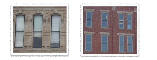
Figure 2.12: Encouraged Windows - replacement windows that fill the entire window opening
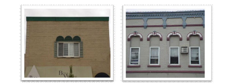
Figure 2.13: Discouraged Windows- Windows that are both not to scale with the façade or the traditional window openings.
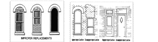
Figure 2.14 Window & Door Replacements: The photos above demonstrate both appropriate and inappropriate window and door replacements.
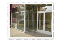
Figure 2.15: Discouraged Storefront - Storefronts without a knee wall or base.
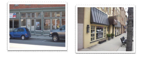
Figure 2.16: Encouraged Storefront- Knee walls and windows making up the majority of the storefront demonstrate a strong base.
2.03.2 - Entrances
A building entrance serves both building tenants and customers. In addition, it can enliven the building's context. A city block with buildings with entrances directly accessible from the public sidewalk encourages pedestrian traffic and increases possibilities for more activities - shopping and social interactions.
• Entries should be prominent features of the base. They should be different from the standard building bay through articulation, elaboration, and materials.
• Entrances should be easily recognizable to the pedestrian.
• If possible, commercial buildings should not use residential doors.
• There are a variety of ways to enunciate the entryway to a building:
o Arched entries
o Recessed entries - two feet from surrounding façade
o Projecting entries
o Decorative molding above doorways
o Columns
o Signage
o Planters with ornamental landscaping
o Oversized doors
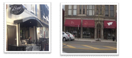
Figure 2.17: Encouraged Entryways- Articulated design, and materials help to enunciate the entryway to these buildings.
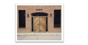
Figure 2.18: Discouraged Entryway - Opaque windows, and windows that do not make up the majority of the storefront give the appearance of a residential entryway rather than an entryway of a commercial building.
2.03.3 - Awnings
Awnings, canopies and marquees serve many functions, and enhance building façades and sidewalks. They provide store entrances and sidewalks with a sun-screening element, and a shelter from the rain. They unify the building appearance, articulate the storefront and entryways, and provide a surface to place a business name. Careful design and integration with the building façade design are important considerations to prevent clutter and façade distractions.
• Awnings create visual interest while shielding pedestrians from weather. They should be compatible in both material and style with adjacent properties. Awnings may have advertise goods and provide visual cues to the location of the entrance.
• Awnings should not obscure the architectural features of the building and should reinforce the frame of the storefront.
• Awnings should be in proper scale with the building.
• Awning material should be compatible with building materials and style.
• Canvas or metal are generally suitable materials for awnings
• Plastic, backlit awnings, and shiny or bubble awnings should be avoided.
• Scale of signage on awnings should be minimal.
• Simple, flat-sloped awnings are encouraged.
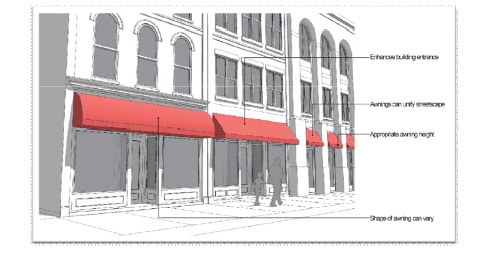
Figure 2.19: Encouraged Awnings- Awnings that do not obscure structural details, are simple in design, and are compatible with the building materials.
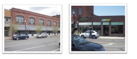
Figure 2.20: Encouraged Awnings- Awnings that are to scale with the windows and entry of the building.
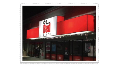
Figure 2.21: Discouraged Backlit Awning - Plastic backlit awnings are not appropriate.
2.03.04 - Signage
Signs and communication are necessary but sometimes unattractive components of business operations. It is important to reach a visual balance between drawing pedestrian attention, and creating an attractive area free of visual clutter by integrating signage into the overall design of the building/storefront.
• Projecting signs create visual interest and can assist businesses in advertising.
• Signs should fit existing features of the façade and not cover major architectural elements.
• Signs should be mounted somewhere above the display windows and below the second story windows.
• It is recommended that window signs do not exceed 30% of the total glass area of the window.
• Remove unused/outdated signs and repair any holes resulting from the removal of the sign(s).
• Signage should be scaled to pedestrian use within district.
• Signage should complement the building character.
• Back-lit box signs should be avoided.
• Freestanding signs should be temporary and used only for special events. Permission from the Zoning Officer may have to be obtained before using freestanding signs
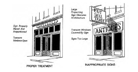
Figure 2.22 Signs: Appropriate vs. inappropriate signage
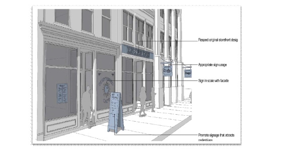
Figure 2.23: Encouraged Signs - Signs that are to scale with building elements help to appropriately advertise for business and reduce visual clutter.
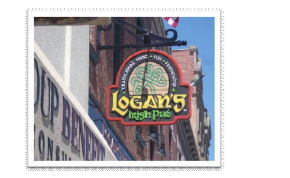
Figure 2.24: Encouraged Projecting Sign - Projecting signs help to create visual interest
2.03.5 - Lighting
• Protruding light fixtures also add visual interest while highlighting building details.
• Any lighting should minimize glaring and light trespassing. Lighting near mixed-use buildings should not have a direct impact on upper story residential windows.
• Lighting shall complement retail display and nighttime activities.
• Signs with opaque backgrounds should be lit from the exterior by wall-mounted, focused, directional lights. The lighting exposure should be limited as to illuminate the sign content.
• Neon lighting should be minimal and restricted to "Open" signage visible through the street level windows only. Strobe lighting is not permitted.
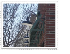
Figure 2.25: Encouraged Projecting lights - Projecting lights
2.03.6 - Color
Within traditional main streets, neutral and subtle colors are considered more contextual or pleasing than high intensity, metallic or fluorescent colors. Colors and finishes that enhance the collective image of traditional main streets are contextual, which reflect tasteful and responsible artistic expressions.
The City does not have a required color palate for the Downtown Design Review District but the color selection process should fit the character of the downtown.
• Bright fluorescent colors should be avoided.
• Brighter and darker hues should be used sparingly for smaller accent features or to draw attention to details, such as a door.
• Colors should accentuate architectural details of the building.
• Color schemes should be simple, using the minimum number of colors necessary to achieve a desired look.
• The color selection should complement the predominate hues of the adjoining buildings.
• If masonry must be painted, select colors that are similar to the natural range of the brick.
• Stripes, polka dots, checkerboard patterns and other distracting paint combinations are discouraged.
• Neutrals, earth tones, and natural materials of both low reflectance and subdued shades are encouraged.
• Building colors should be consistent on all sides.
• Appropriate color palettes are noted in the Appendix.
2.04 Site Improvements
2.04.1 - Fencing
Fencing around a building or site can serve many functions. It can mark boundaries, provide screening, control entry and exit, and to provide a form of security. Security fencing around a commercial establishment can portray defensiveness toward the pedestrian and negatively impact neighboring properties. Although there are not many fences within the downtown, there are cases in which they are appropriate. Special consideration should be given to the type of fencing used.
The following types of fencing are discouraged:
• Chain link
• Wood privacy
• Vinyl fencing
• Split rail fencing
The following is encouraged:
• Metal wrought iron fencing
• Masonry walls
• Combination of masonry wall and metal wrought iron fencing
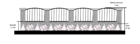
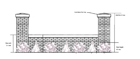
Figure 2.26: Appropriate Fencing - fencing material can create a more inviting appearance.
2.04.2 - Parking Lots
Parking lots consume vital land, separate buildings from public sidewalks, break up continuity of the street wall and can be visually intrusive if not screened and landscaped appropriately. Consideration for physical qualities like appropriate building sitting, building site relationship, landscaping and screening elements not only reduces the negative visual impact of parking lots, but also improves the walkability, livability and safety of the main streets.
• Parking lots should be set back from the street lot line or the back or the sidewalk.
• Locate parking lots behind buildings as close as possible to rear entrances.
• Large, paved areas for off-street parking should be screened with walls, fencing, or plants.
• Concrete curbs are the appropriate edges for the parking lot. Avoid blocks or bumpers.
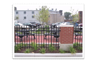
Figure 2.27: Appropriate Parking Lots - Good example of parking lot
2.04.3 - Landscaping
Landscaping can provide visual appeal and environmental comfort. It improves both the appearance and property value while instilling confidence and pride in the area. Landscape design works with a variety of elements that include water, screening, fencing, lighting, as well as hard (non-living elements.) and soft surfaces (living elements). Trees, when appropriately located, provide shade and windbreak, and help to create a pedestrian-friendly environment.
• Landscaping can create pedestrian friendly sidewalks by separating vehicles from pedestrians. Benches adjacent to landscape areas assist in creating pedestrian friendly spaces.
• Dead or dying plant material should be removed and replaced as needed.
• Avoid plastic of artificial plant material.
• Trees can serve as a buffer between pedestrians and the road as well as help with screening sun and wind exposure.
• Trees should be in scale with their surroundings and planted so as not to impede with pedestrian traffic flow.
• Trees should be deep rooted to avoid upheaval of the sidewalks.
• Tree should be selected to fit the climate, soil type, and environment for which they are planted.
• Façades can be enlivened by the addition of hanging plants. Hanging plants, however, must not impede pedestrian traffic.
• Window planters are also recommended to enhance the greenery of the streetscape.
• Landscaping can be used to soften fencing as noted in Section 2.04.1 above.
Figure 2.28: Appropriate Landscaping - Good example of parking lot
2.04.4 - Mechanical Systems
• AC units distended from windows are not allowed.
• New mechanical systems/additional mechanical services should be placed out of the line of sight when possible.
• Special precautions should be taken when installing new mechanical systems in older buildings to ensure that both the interior/exterior of the building is preserved.
• Rooftop units visible from the street shall be screened from pedestrian view with a material in keeping with the architecture of the building.
(Ord. 2018-035. Passed 5-1-18.)