The following are criteria to be used in evaluating appropriateness of structures and/or alterations of such structures within the Historic District.
(a) Spacing.
(1) "Lot coverage" is the percentage of lot area covered by the primary structure; building to lot coverage provides an important component of building spacing by being a measure of the density of developed land along each block front and on each lot. New construction should have a lot coverage similar to those of existing buildings in the area. For example, compare:
(2) "Setback" is the distance from the edge of the right of way to the building front. Uniformity of front yard setback establishes a framework of order and coherence, and insures a strong and continuous streetscape. Consistency of setback is an especially important unifying factor where building styles vary. For example, compare:

(3) "Building height" is the distance from the average finished grade at its intersection with the front of the building to the highest point of the building. Consistency of height is an important factor contributing to the scale and character of an area. Buildings quite different from the predominate pattern of an area will disrupt the area's structural relatedness. It should be realized that the perceived height frequently differs from actual height. The perceived height is a product of the number of stories, the relationship of height and width, the height of porches, and other visual factors. The actual height depends mainly on the height of each story and pitch of the roof. Both measurements of height should be considered. For example, compare:

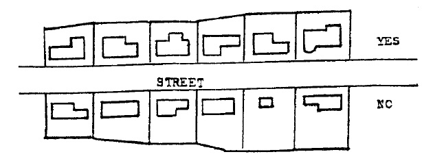
(4) "Spacing of buildings" refers to the distance between adjacent buildings. Closely spaced buildings have a strong spatial tension, or attraction between them, while buildings distant from each other have little force of attraction. Additionally, regular patterns of spacing convey a sense of order and cohesion; regularity of rhythm adds strength and continuity to the streetscape for an observer moving along a street. The spacing of buildings will be affected by the minimum side yard requirements in the Zoning Ordinance. For example, compare:

(b) Architectural Design Components. "Architectural design components" refers to aspects of the design of each individual building. These components must be compatible within the building as a unit as well as with the buildings's surroundings. Design components help provide a sense of unity and coherence within the historic area.
(1) Exterior building and roofing materials. The dominant building material for a particular streetscape may be brick or wood siding for example; or the dominant roofing material may be asbestos shingles or tin. A mixture of materials adds variety to an area, but a degree of variety which becomes chaotic should be avoided. Ideally, materials used in new construction or remodeling should exhibit an affinity with existing materials in the area. Additionally, some buildings and roofing materials (such as artificial brick or stone siding) may be inappropriate for the style or character of existing buildings; the use of such materials in remodeling should be discouraged.
(2) Exterior texture effects result from the nature of the materials used, such as the horizontal regularity of wood siding, or the roughness of brick with tooled joints. Texture may also result from the repetition of architectural details, such as porch balustrades. New buildings using textured materials or details are less obtrusive in old areas of finely scaled detail.
(3) Proportion of width to height of openings. This proportion of width to height applies to openings within the facade, such as doors and windows. In a sequence of buildings, the use of similarly proportioned openings will help establish the relatedness of structures. Openings which vary significantly from that which exists in surrounding buildings may have a disruptive effect on the character of an area. For example, compare:

(4) Architectural styles. Use of forms which are especially indigenous to the area, such as porches or cupolas, should be encouraged in order to enhance the elements which contribute to the distinctive character of the district. Motifs in detailing which are prevalent in the district, such as certain stained glass forms or types of bracketing, should be retained whenever possible for their continued contribution to the area's unique qualities.
(5) Roof form and pitch in relation to facade. Roof forms in a given streetscape may be gable, hip, gambrel, mansard or flat, and pitches may vary. Roof forms and pitches should be in harmony with the predominant type in the neighborhood. For example, compare:

(6) Shape and form of the building. The basic shape and form of the facades of new structures or additions should be compatible with facades' shapes and forms already existing in the area. Facades with highly or unorthodox shapes and forms may not be in harmony with existing structures, and they may call undue amounts of attention to themselves. Similar consideration should likewise be given to the shape and form of the building as a whole. Construction of additions and appendages should follow the guidelines under subsection (b) hereof, so that they will respect the original design in the use of materials and details, as well as shape and form. (However, it must be recognized that "Victorian" architecture delighted in unusual shapes and forms and asymmetry. Victorian houses may have polygonal bays, turrets, unusual gables, and oddly placed windows. "Unusual" additions to such structures may be entirely compatible with the original design and may fit well in the neighborhood, if they are thoughtfully designed.)
(7) Architectural detailing. Details such as lintels, stained glass, foundation materials and chimneys give a building or set of buildings an identity and distinctive character. Older buildings in particular tend to display a very fine level of detail. New construction should seek to reflect the level of detail in an area; blank facades introduced into an area of detailed buildings will disrupt the quality of design.
(8) Color. Appropriate paint colors should be recommended for each building according to the age and architecture represented. The colors of adjacent buildings, as well as the streetscape in general, should be taken into account. It might be decided, for instance, that where red is an appropriate color based upon the age and architecture of the building, it might still be preferable to decide in favor of gray because of colors of the adjacent structures and the general streetscape.
When the concern is with new construction in a preservation district, care should be taken to avoid colors of contemporary origin that clash or loudly contrast with the older colors. Earth shades are preferable for new construction, or colors which predominate in the surrounding older buildings so as to minimize the impact of any conflict in design.
It should be noted here that excellent contemporary architecture is not in conflict with the concept of a preservation district. It is only necessary that due consideration is given to the spirit and atmosphere of the immediate area.
Color choices will be conditioned upon the areas of color surfaces involved, the material to be affected and the issue of building color versus signage or accent color. No prior draft of rules can possibly determine color appropriateness in all areas.
(c) Signage. The existing articles of the Zoning Ordinance dealing with signage would apply to the Historic District with the additional guidelines.
(1) The signage for a particular building or shop be reduced to the fewest separate panels and/or statements possible. The description of goods or services beyond the basic statement of the nature of the business, should be restricted. Example: "The Old World Delicatessen" would not be followed with the usual "wine, pop, cola, beer and party mixes sold here". Any owner has the right to place signage within the shop window to more fully elaborate on his goods, providing the signs are not contrary to the intent of the total signage criteria. (See subsection (c)(5) hereof.)
(2) Most buildings are designed with a definite panel or framed zone for the sign mounting. This should be used with the sign taking a complimentary shape.
(3) Letter styles are many. Keep to one, or at most two, styles or faces at each shop. This enhances readability as well as creates a more dependable "logo" for the shop.
(4) Colors are a highly subjective item. Colors should be highly compatible within the sign itself and should correlate with the building colors. Bizarre color combinations intended to shock the eye should be restricted as being incompatible with the streetscape. Good contrast is essential for distant readability. Some established logos will warrant recognition.
(5) Material used can be a variable, but natural looking materials are desirable.
(6) Excellent signs already in place would be cited as a guide for future sign-making petitioners. A body of sign photos or drawings from elsewhere can be used as preliminary guidelines.
(7) Signage needed for public instruction should be the subject of a special program and assignment wherein all existing signage (locational, directional, instructive) be reviewed for effective size, placement and message. A new consistent logo and letter style should be developed and put to use in future sign replacement. The culminating design should reflect excellence of letter design - clear and vigorous, not whimsical.
(8) Signage need not always be externally fixed on a building. The fine art of lettering on glass, once very common, deserves a comeback and would be a sound solution. Projecting signs can be highly successful if thoughtfully styled and scaled to avoid either a heavy or a trivial appearance. The goal is to match sign with building or product and to do so within reasonable limits of size and placement and with compatibility with the streetscape.
(9) It is further recommended that no signage of commercial nature be erected in the right of way or tree lawn. Vistas up and down the street are injured by such pole or stem-mounted signs, especially where excellent tree forms cover the message in the first place. Projecting signs are not out of place when formally attached to the building facade, but their size becomes critical to avoid blocking the view of the buildings beyond.
(Ord. 20-1978. Passed 9-19-78.)